
Creative web design vs performance: when a striking website can still be fast
Creative websites impress, but images, fonts and animations cost speed. When such a project makes sense, which techniques to use and how to protect SEO.
Creative websites, like the ones that win design awards, draw attention: unusual typography, animations that react to scrolling, full-screen photography. A project like this can build a brand's image more effectively than yet another tidy template site. It also has a performance cost, because every effect means extra files, extra computation and extra work for the browser.
Striking design and site performance do not always go hand in hand, but they need not rule each other out. With more effort and well-chosen techniques it is possible to build a site that impresses and still loads smoothly, on phones included.
Not every project can afford the wow factor
A creative site works when the brand is well known and the site is mainly there to build its image, when it is not directly responsible for sales or enquiries, or when it is a separate project next to the main website. A typical example is a dedicated landing page for a campaign or collection that grabs attention while the store runs separately and stays fast and predictable.
Where loading speed and responsiveness to clicks come first, such as in a store, an order form or a customer account, it is easy to overdo the design. Every extra animation on a product page or in the cart raises the risk that the customer gives up before the page responds.
Creative web design techniques
Sites focused on visual quality rather than performance rely on techniques that look good but load the browser to varying degrees:
- Parallax: layers moving at different speeds while scrolling, creating depth. Built in JavaScript, it can make scrolling stutter on weaker phones.
- Glassmorphism: semi-transparent panels with a blurred background, resembling frosted glass. Background blur is expensive, especially while scrolling.
- Neumorphism: soft, embossed-looking elements made of shadows. It is easy to end up with too little contrast and poor readability.
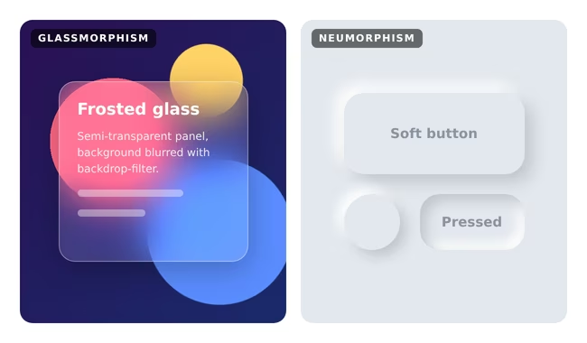
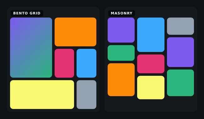
- Bento grids: content arranged in tiles of different sizes, like compartments in a bento box. Technically light, but they need a well-planned mobile version. An alternative is a masonry layout, where tiles of equal width and varying height fill columns without gaps, as on Pinterest. It works well for galleries and portfolios, but when built in JavaScript it can shift elements while loading and worsen the CLS metric.
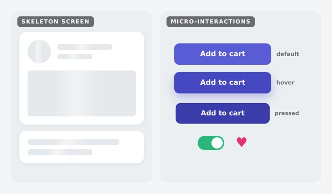
- Micro-interactions: small reactions to hovering, clicking or toggling that make a site feel alive.
- Blend modes: text and images layered with effects familiar from graphics software.
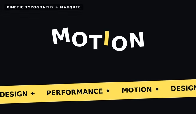
- Kinetic typography: text that moves, changes or arranges itself in step with scrolling.
- Skeleton screens: content placeholders shown while loading. This technique improves perceived speed instead of lowering it.
- Infinite marquees: strips of text or logos scrolling in a loop.
- Scroll-driven animations: effects tied to scroll position. In current browsers they can be built in CSS alone, without weighing the page down with JavaScript.
- CSS mesh gradients: smooth, multicoloured backgrounds made of several overlapping CSS gradients, often lighter than an image with the same look.
- Morphing clip-paths: shapes that flow smoothly into one another, for example in transitions between sections.
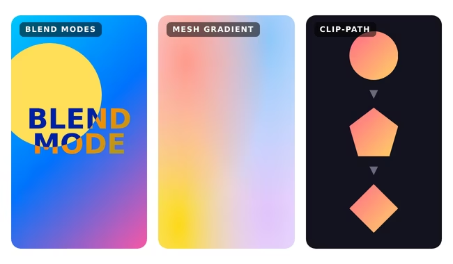
The strength of a creative site rarely comes from the number of effects. More often it comes from two or three techniques chosen for the brand's character and refined in the details.
High-quality images come at a price
In creative projects clients often require images in high quality and resolution, which is understandable, since they create the impression. Each such photo, however, means megabytes the visitor's phone has to download. The answer is not to give up quality but to optimise: modern formats such as AVIF and WebP, several sizes of the same photo matched to the screen, lazy loading for images below the first screen and compression tuned so the difference cannot be seen. A large photo in the first screen determines the LCP metric, so it deserves the most attention.
Fonts work the same way. You cannot add five typefaces in several weights and expect the site to stay fast. Each font file is another download, and text in that typeface renders properly only once the font reaches the browser. Limiting the number of typefaces and weights helps, as do variable fonts, which pack many weights into one file, and subsetting fonts to the characters the site actually uses.
Animation in moderation
An animation that runs smoothly on the designer's computer can make scrolling stutter and delay responses to clicks on a few-years-old phone, which worsens the INP metric. Animations based on movement and opacity, which browsers handle efficiently, are safer than ones that change the size or position of elements in the layout. The system setting for reduced motion deserves respect too, because some people tolerate animation poorly and are entitled to turn it off. Animation should emphasise something, not hide the content.
An animated background in practice: GigaBackground
A good example of these principles is GigaBackground, an animated background generator maintained by BeGiga. It creates fluid animated backgrounds from any image, and the whole animation runs in the browser on WebGL shaders, which means on the graphics card rather than in JavaScript recalculating every frame. Effects are stacked in layers: fluid image distortion, swirls driven by a map (extracted automatically from the image, hand-drawn in a pen editor or generated as a radial, spiral or vortex pattern), drifting colour blobs sampled from the image, halftone, RGB split, vignette and film grain. The animation can be triggered by scrolling, mouse movement or an automatic loop, and each effect can be tuned separately.

From a performance point of view, how the background reaches the page matters more than the effects themselves. The generator produces a static PNG poster showing the background in its initial state, before any animation starts. Visitors see a finished image straight away, and LCP does not wait for WebGL to initialise. The animation itself can start only after the page has loaded, by calling window.GigaBackground.start(), so the heavy part does not compete with content for browser resources. A finished configuration is exported as a JSON file or as HTML with the settings and poster embedded.

The generator is most comfortable to use on a desktop, as the settings panel has dozens of parameters. When deploying it on a site, it is worth planning a mobile version, for example with fewer layers or just the poster in place of the animation.
Great on desktop, awkward on mobile
A design that looks great on a large monitor can turn out unreadable and awkward to use on a phone. Small text laid over a photo, elements scattered freely across the screen, effects that react to a cursor the phone does not have. Responsive design in creative projects rarely comes down to shrinking elements. Sometimes a separate mobile layout is needed, with a different composition, simpler animations and different photo crops. It is extra work, but for most visitors that version is the site.
Proportions and transitions between sections
A creative site's character comes not only from effects but also from rhythm. Section proportions, the amount of white space, changes of pace between denser text and full-screen imagery, and the way one part leads into the next add up to a coherent story. Well-designed transitions, through background colour, edge shapes or scroll animations, guide the eye onward. Poorly chosen ones break the page into random pieces or make visitors wait for an effect before the content appears.
SEO and design: best planned together
SEO specialists' recommendations cannot always be applied without turning the design upside down. An H1 heading baked into an image, sections with a single slogan instead of a paragraph, content hidden in tabs and carousels, headings picked for looks rather than structure: fixing these after the design has been approved usually means rebuilding many sections. Performance adds to this, because a slow site also loses out in search results.
In an ideal world, content and design are created at the same time. The designer knows how much text a section must hold and which headings belong in it, and the person responsible for content and SEO knows which effects the designer plans. Text is then real text rather than an image, headings form a logical structure and images have descriptions. Compromises are made at the design stage, not after launch.
Simpler and cheaper without a CMS
A creative site often has few pages and content that rarely changes. If a content management system drops out of the requirements, along with a panel for editing every section, the project becomes noticeably simpler. There is no need to fit every animation to an editor, foresee what happens when someone pastes text that is too long, or maintain plugins. Such a site can run as a static site, and building it takes less work and costs less. The articles on websites without a database and static site generators or WordPress cover this approach in more detail.
Where to look for inspiration
Good sources of inspiration are sites that regularly recognise websites for design, creativity and execution: Awwwards, CSS Design Awards and Web Design Awards. With every site it is worth looking beyond the first screen: how it looks on a phone, how quickly it loads and whether it is comfortable to use. Some award-winning projects are experiments that shine in a competition but not in everyday use.
Creative web design built with performance in mind
A creative project calls for decisions: which effects matter most to the brand, where compromise is acceptable and how the site should behave on weaker devices. BeGiga builds such sites as part of its custom web projects, combining visual design with optimisation of images, fonts and animations.
Frequently asked questions: Web design
Can a creative website be fast?
Yes, but it takes more work than a template site: optimised images and fonts, animations built on efficient CSS properties and testing on weaker phones. It usually also means a compromise, choosing a few key effects rather than all of them at once.
Does striking web design hurt SEO?
It does not have to, as long as content and design are planned together. Problems appear when text ends up inside images, headings are chosen for looks, and SEO feedback arrives only after the design has been approved.
Does a creative website need a CMS?
Not always. Brand sites usually have few pages and content that rarely changes. Dropping a panel for editing every section simplifies the project, allows a static build and lowers the cost of producing the site.
- Web design
- Performance
- Animations
- Responsive design
- SEO